Repeat Oblique Photography: When You Cannot Wait for a Golden Dataset
This piece is part of a three-part series on ground truth, federation, and the anchor point. Read the series guide for context on how the three pieces fit together.
The sensor changes. The coordination problem does not.
There is a version of the golden dataset problem where you do not have time to build one.
The situation is moving. Decisions cannot wait for a curated, validated, stewarded product. People need a shared picture fast enough to act on while the situation is still live.
This field note is about what you do in that gap. And about what happens when the same gap stretches across decades instead of hours.
Scene One: Rhode Island Floods
Rhode Island floods. The early hours are always the same: fragmented reports, partial sightings, and confident statements built on thin evidence.
In that moment the limiting factor is not intelligence or effort.
It is time.
I was in the area. I had the capability. So I made the collection.
The images were not a scientific product. They were not validated against ground control points. Nobody commissioned them. But they found their way into the local emergency management situational awareness cycle, and they reduced confusion at a moment when confusion was expensive.
Not perfect. Not a golden dataset. Good enough to reduce confusion.
What the imagery showed
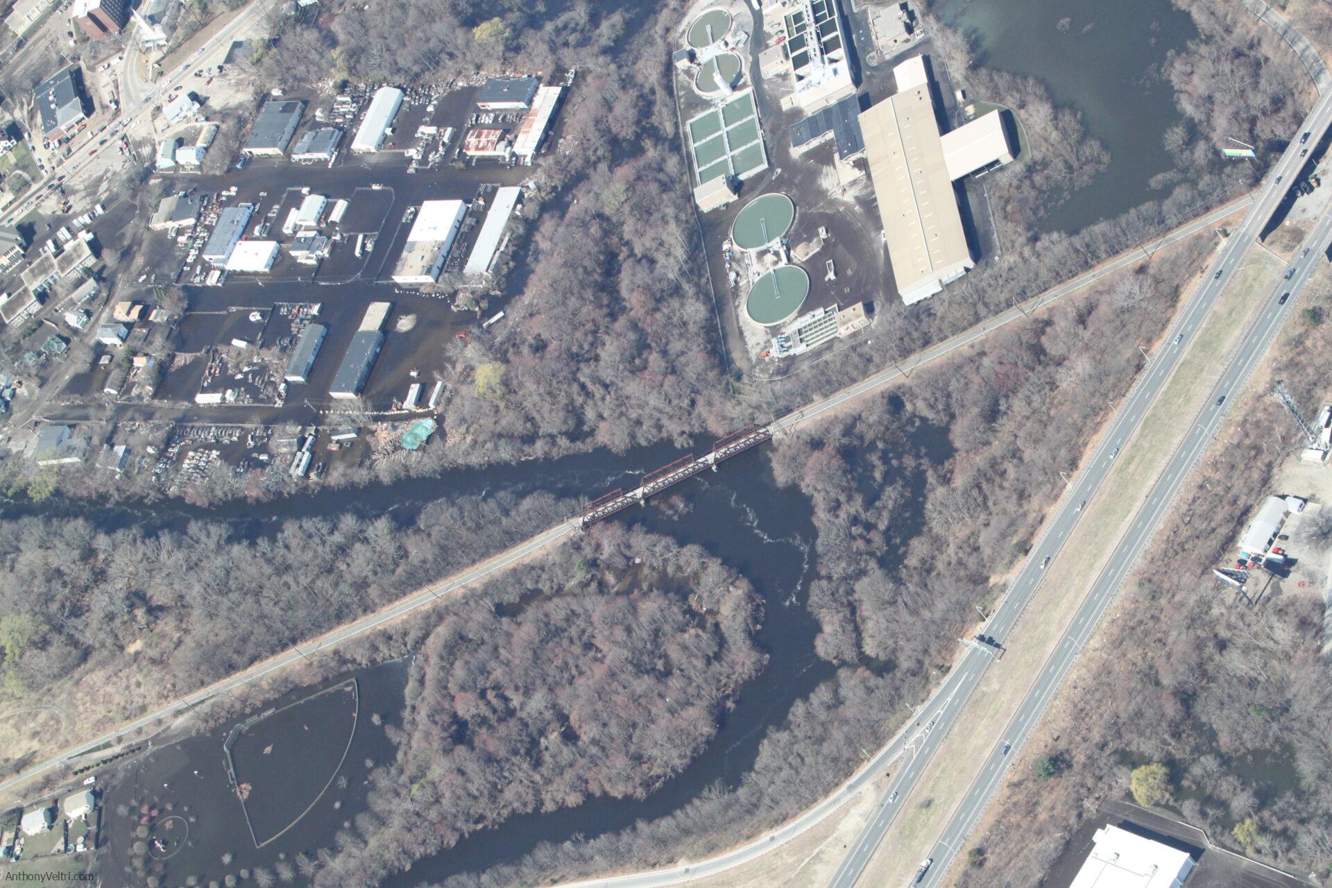
Figure 1: Wastewater treatment facility under flood conditions. The point was speed. Establish a shared, georeferenced picture of impact and access constraints before secondhand reports harden into competing narratives.
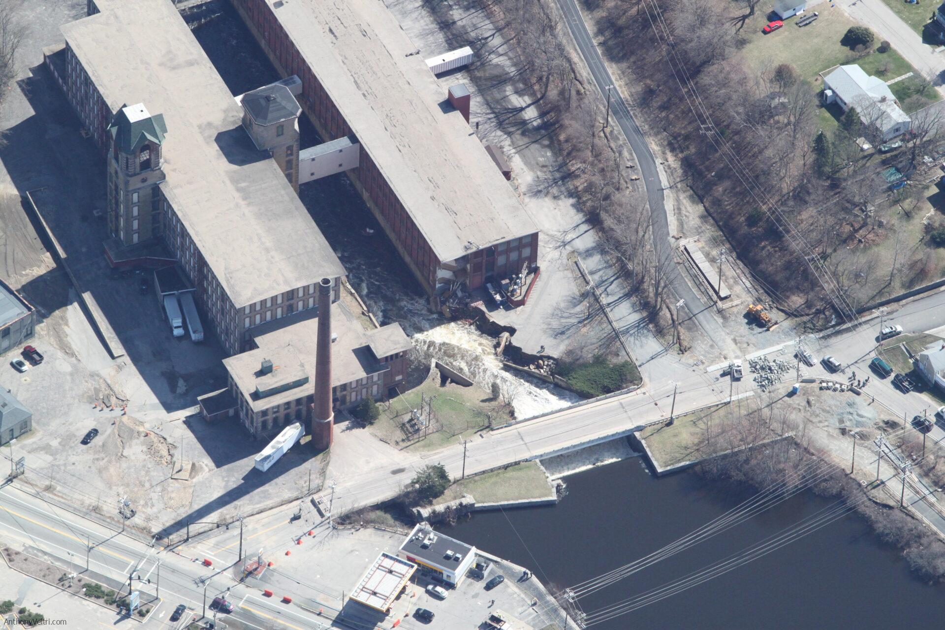
Figure 2: Industrial mill site, structural and bank failure at the river edge. Obliques compress interpretation time because the relationship between structure, flow, and access is visible immediately. You do not need to explain it. You show it.
This Was Not the First Time
The Rhode Island floods were not where I learned this pattern. They were where I confirmed it worked at speed.
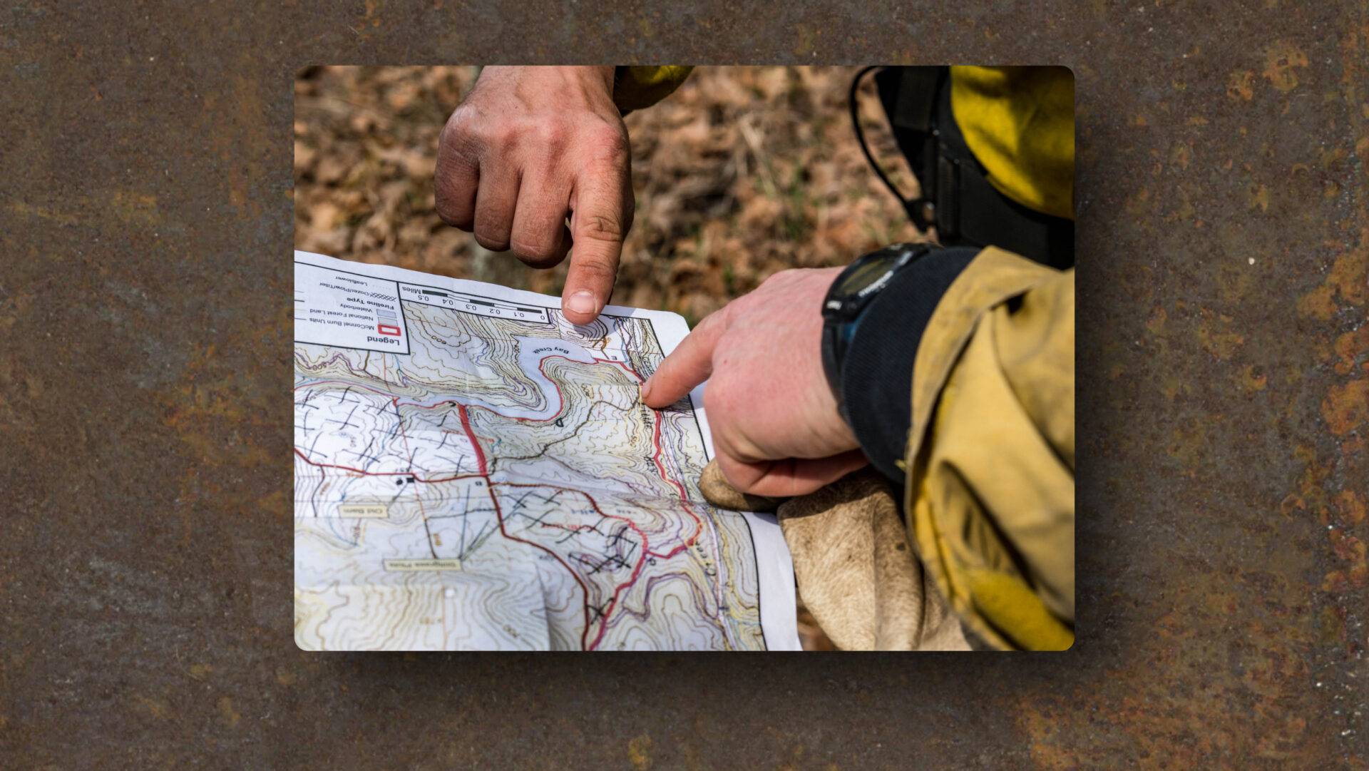
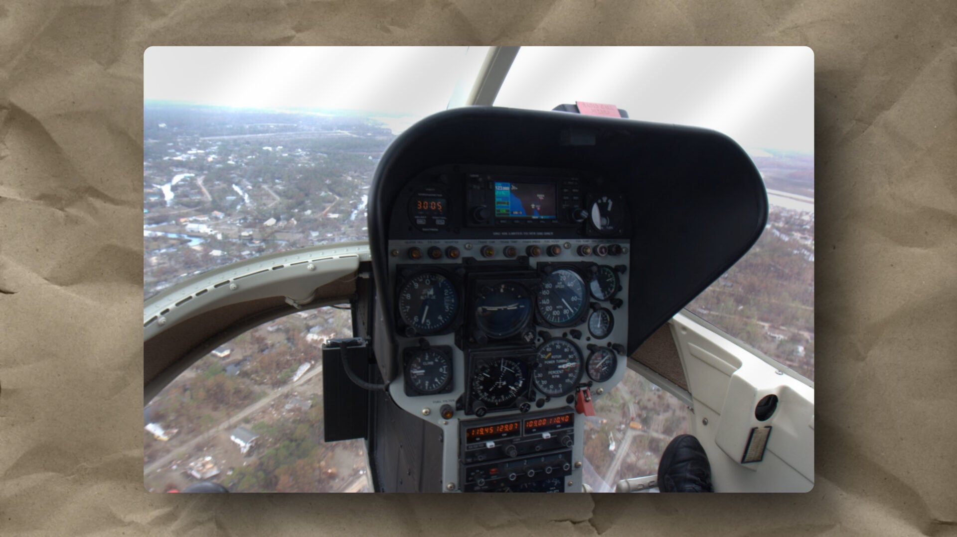
The earlier version was the Gulf Coast in 2005, Hurricane Katrina response. I was aboard a rotary-wing platform collecting oblique imagery over communities that had been effectively cut off from any shared situational picture. The scale of destruction made standard reporting frameworks nearly useless. Nobody was arguing about methodology. They needed to know what was passable, what had collapsed, and where the water was still moving.
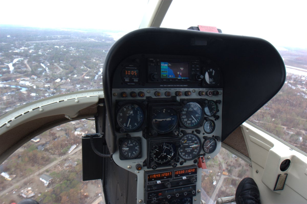
What made that collection harder than anything I have done since was the absence of automated geotagging. Every frame had to be anchored manually. You logged your track, you noted your timestamps, and later you reconciled the two to place the imagery in space. It was slow and it was imperfect. But it worked because the alternative was no spatial anchor at all.
The product was built inside Google Earth. Not because it was the most sophisticated tool available. Because the Incident Commander could drive it himself during the situational awareness briefing without relying on the author to be in the room. I trained him on it. He presented his own picture to his own people from his own ground truth. I was there. I just was not required to be.
That was the point. Not to own the data product. Not to be the person who explained what it meant. To build something honest enough and simple enough that the decision maker could reason from it directly, and then get out of the way.
That experience made something permanent clear. The tools that came later, automated GPS tagging, synchronized clocks, direct KML export, did not change what was required. They reduced the friction of meeting the requirement. The physical ground truth was always the point. The technology just made it easier to be honest about where you were when you saw what you saw. And a product that empowers the person who needs it, rather than creating dependency on the person who built it, was always the goal.
It Was Never About the Photos
At the time this looked like oblique photo collecting.
But the core move was governance through ground truth:
- Turn scattered observations into a shared baseline
- Shorten the argument cycle
- Reduce decision latency without increasing operational risk
This is the same muscle remote sensing trains: geometry, scale, interpretation under constraints, and delivery to the actual audience.
The sensor changes. The pattern stays.
The Rapid Truth Artifact
A rapid truth artifact is a fast, legible, georeferenced visual package that helps a mixed audience align without debate.
It answers the questions people really ask under pressure:
- Passable or not
- Undermined or intact
- Accessible or cut off
- Where the failure connects upstream and downstream
This is interpretation-first, not measurement-first.
It is better than nothing, which is often the true alternative.
The workflow (kept simple on purpose)
Complexity slows you down. Here is the pattern I use.
Before collection:
- Define the decision questions for the next 12 hours
- Build a target list of points and linear features
- Plan for target density, not scenic coverage
- Sync time across devices
- Decide naming and folder structure before you leave
During collection:
- One safe, legible pass per target
- Wide, medium, and tight frames
- Include approaches and upstream context, not just the failure point
- Stop when you feel tempted to do one more pass
After collection:
- Offload and back up once
- Geotag from track log
- Export something browseable
- Publish with a one-paragraph note on how to use it
Stated limits
Lighting, season, and geometry change what is visible. That is not a flaw. It is the environment.
This product is not scientific change detection. It is decision support. Your mileage will vary, but the alternative is often slower confusion.
2026 Update: Drones Changed the Tool, Not the Move
Today a drone frequently replaces the manned-aircraft portion of this workflow. I hold a Part 107 certificate and have used this pattern from both platforms.
The underlying move is the same: reduce decision latency without creating new risk. The coordination problem that makes rapid truth artifacts necessary has not changed. Only the platform has.
Scene Two: Pixieland, Slow Restoration, Same Problem
Pixieland on the Salmon River Estuary is the opposite tempo.
No emergency. No hourly tasking cycle.
Instead, the coordination problem is long and quiet:
- Restoration is real but hard to see year to year
- Stakeholders carry different mental baselines
- Progress risks becoming abstract, or political, or “trust me”
So I tried a second version of the same move.
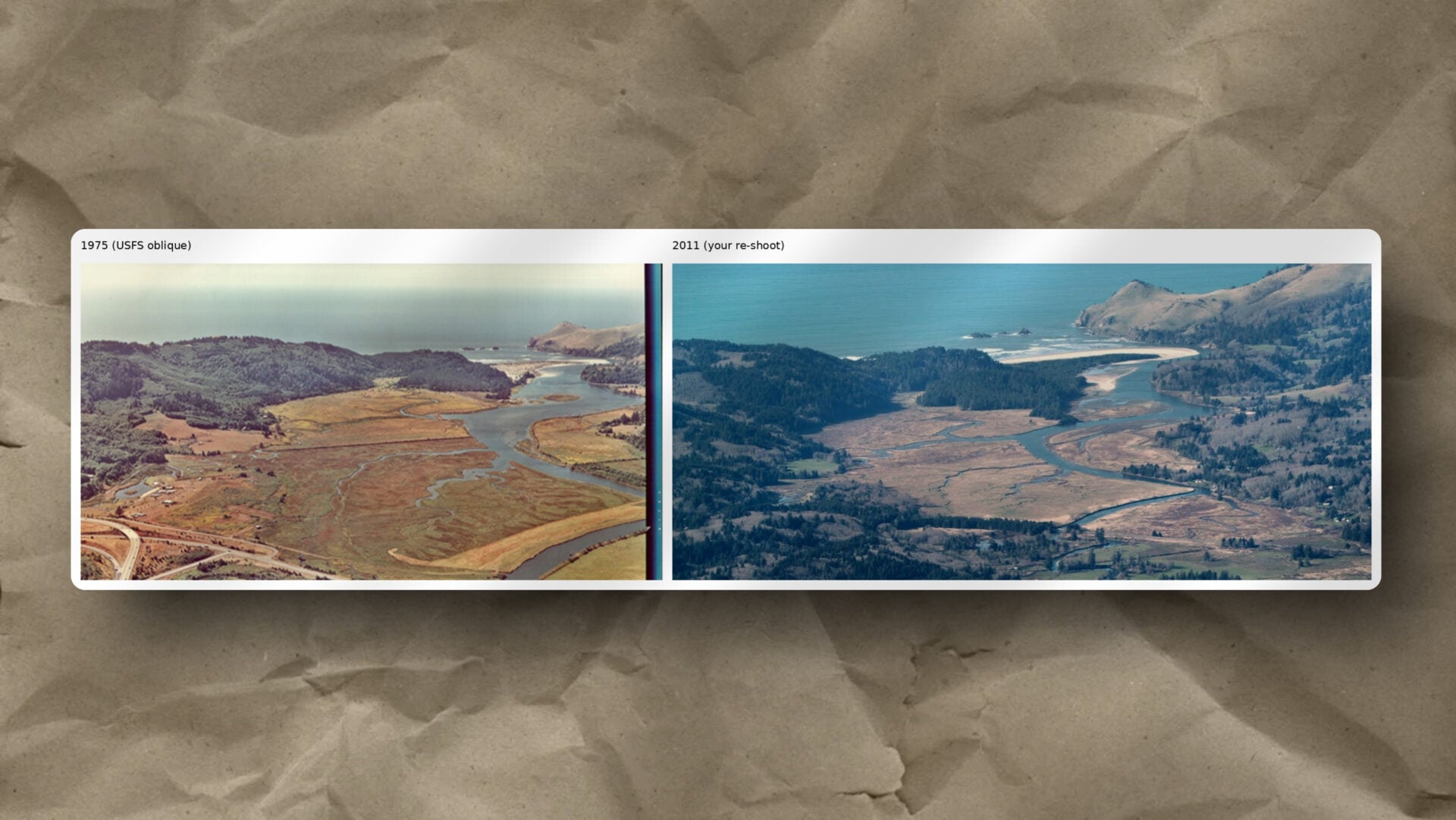
I took the historical 1975 USFS oblique and attempted to recreate it with a re-shoot in 2011. The timing was opportunistic rather than planned. Season, tide, and angle were not optimal. I did not get a perfect repeat.
That was not the point.
The point was to make change legible across decades.
The U.S. Forest Service was managing the restoration and holding a public open house to show stakeholders what had been accomplished. Natural resources managers there were glad to have the repeat oblique. It made it into their write-up. A product collected under imperfect conditions, on borrowed time, turned out to be exactly what the communication needed.
What the imagery showed
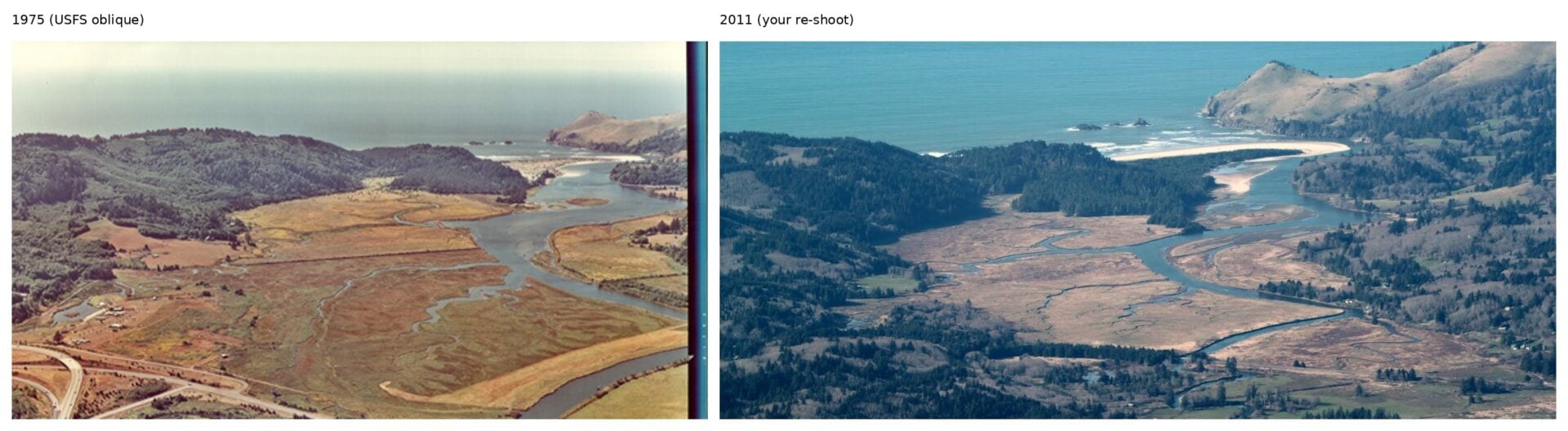
Figure 3: Estuary mouth context, 1975 versus 2011. The goal is not a perfect match. The goal is legibility of system-scale change across decades.
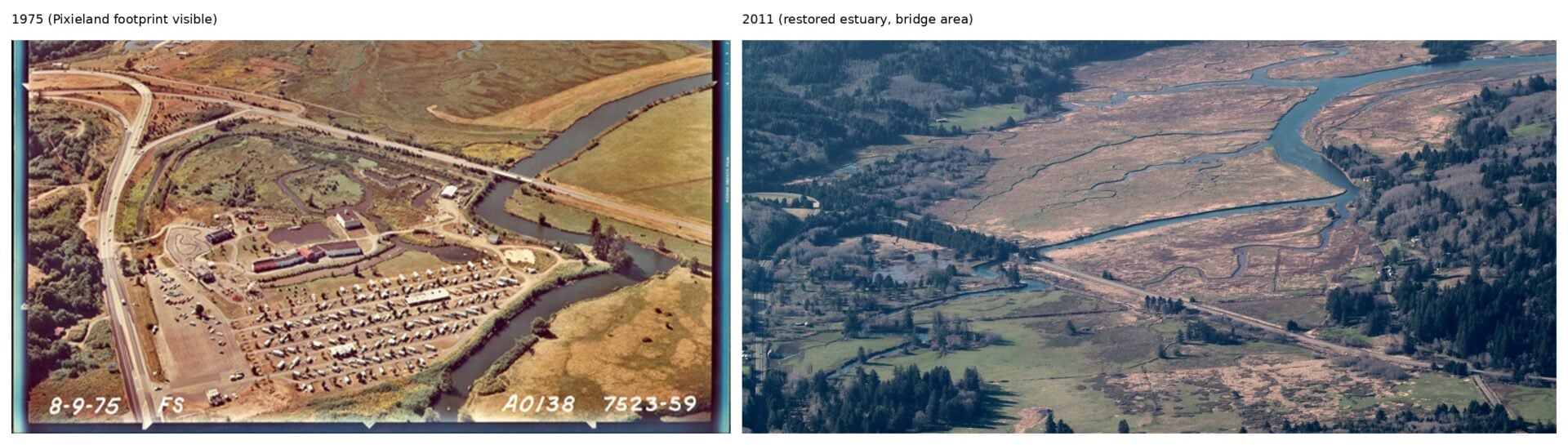
Figure 4: Former developed footprint and bridge area, 1975 versus 2011. A durable baseline that turns “trust me” into “look at this.”
Restoration Has a Messaging Trap
If you only report metrics, most people cannot visualize what improved. If you only show pretty pictures, skeptics dismiss it as marketing.
Repeat obliques land in the middle:
- They show the system, not just a feature
- They create a baseline that survives staff turnover
- They turn “trust me” into “look at this”
Same muscle. Different timescale.
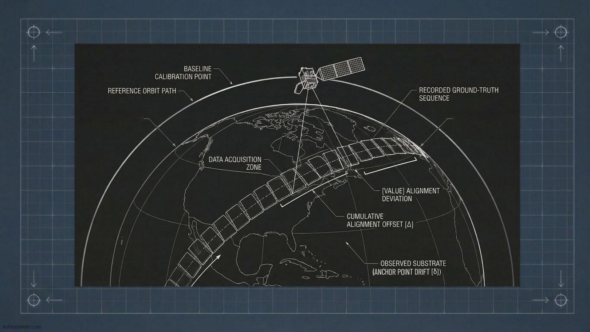
There is a version of this that operates at an even longer horizon. Institutional satellite records, when maintained with care and proper calibration, do the same thing for atmospheric composition, sea surface temperature, and land cover that a repeat oblique does for an estuary. Decades of consistent collection make change legible in ways that no single observation can. The value of that record depends entirely on the anchor points being honest throughout. A gap in calibration continuity does not just affect that year’s product. It corrupts the comparison across the entire record.
The coordination problem is the same. The timescale is just longer.
Why This Belongs in Doctrine (The patterns we observe here)
I have always lived in the seam between governance and ground truth.
Remote sensing gave me a way to think clearly about sensing, geometry, and interpretation under constraints. Operational work gave me a reason to make it fast, legible, and usable by people who are not remote sensing specialists.
Obliques are one expression of that continuity.
The imperfect collection that still served the mission, the opportunistic re-shoot that made it into an official write-up, the emergency imagery that found its way into a decision cycle nobody planned for: none of those were golden datasets. All of them reduced confusion at a moment when confusion was the real enemy.
If you need alignment quickly, do not argue people into agreement. Give them a truth artifact they can browse.
Different decade. Same muscle.
Last Updated on July 12, 2026